As I've used Notion over the years I've come across groups of tips and tracks that have helped me to develop better systems within the application. I want to share these practices across different areas with the hope that you can gain some helpful takeaways.
The first of these areas is visual cohesiveness, but what do I mean by this?
Well, with great power comes great responsibility and in an application like Notion, we are given a blank canvas where we can create a digital workspace in many different ways. Having a myriad of options is fantastic for customization but it often poses a challenge in ensuring that the many different parts of the workspace are united and working together effectively.
Now that you have an understanding of where I'm coming from, let's dive into the first strategy.
Keep a tidy space
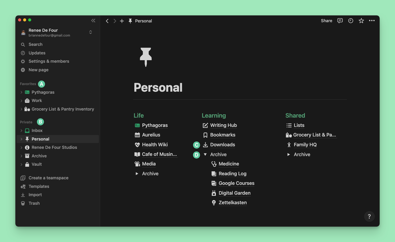
Just as a clean physical environment fosters mental clarity and productivity, a tidy digital workspace serves the same purpose. In Notion, a great place to begin is with keeping a tidy sidebar. This means:
- Only keeping favourites that you actively use
- Using top level pages for the main areas of your workspace which contain nested sub-pages that can be arranged in a dashboard layout
- I also use toggles as mini archives to store pages that I'm not actively using.
- Having a database or page for templates that you duplicate to your workspace. When I download a Notion template, I drag it directly into a downloads database. This is a great practice that I learnt from Jill Metcalfe when I did her Notion Spring Clean Challenge and it's been very helpful in keeping my sidebar clean.
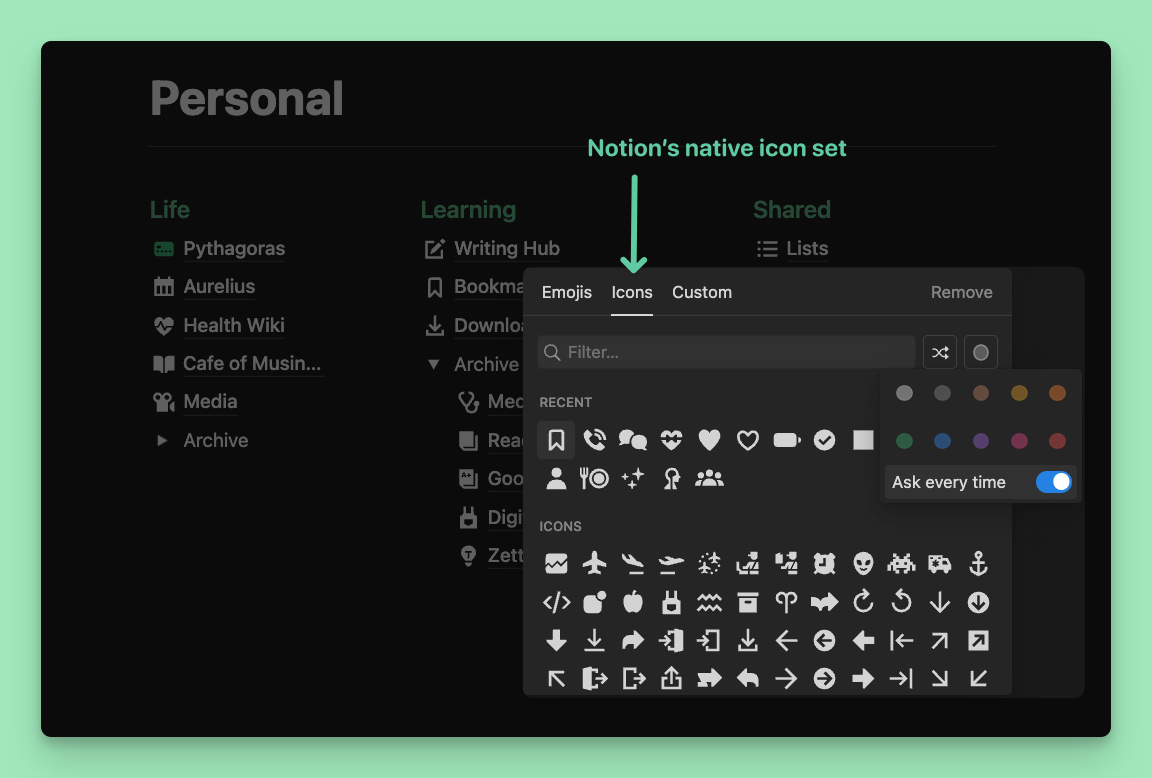
Use icons intentionally
Icons play a significant role in the visual experience within Notion and I personally have a tendency to go icon crazy if I'm not mindful.
To keep my space cohesive:
I stick to 1 set of icons throughout my workspace. I choose Notion's native icons over emojis for 2 reasons:
- I like the options that the native icons give me with color customization especially as I prefer a minimal palette. I find that using both emojis and native icons together can make things look a bit out of place.
- Currently, only native icons can be used for database views and properties. Since I already use this icon set primarily, pages and databases appear more integrated across the entire workspace.
I love that we have the option to customize icons for database views and properties and I do this frequently, however, I want to make the point that this isn’t always helpful particularly for new Notion users and for template creators during the building process. This is because it’s easier to identify the database layout (table, gallery, board, list, calendar or timeline) and the property type (relation, rollup, text, etc.) using the default icons.
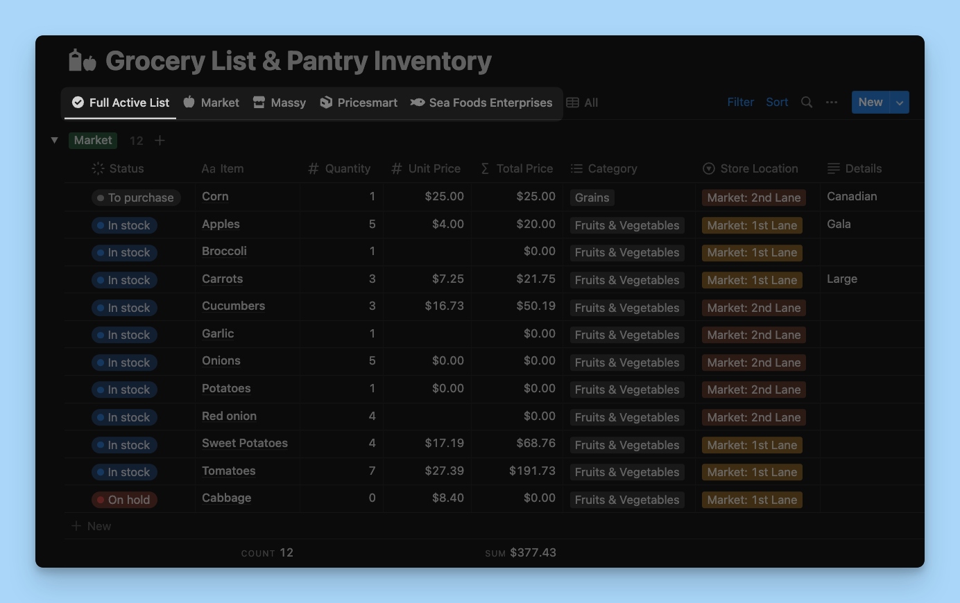
I added custom icons to the image on the left. The icons on the right are the default icons which make it easy to identify the property type at first glance when they are empty.
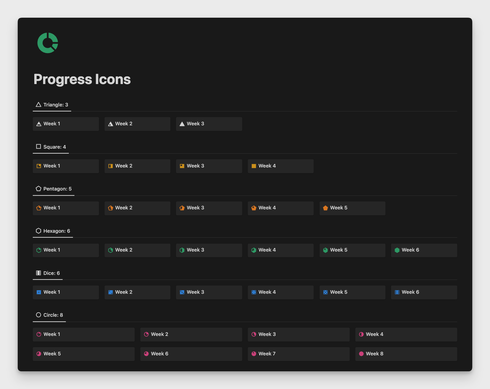
- The last icon related tip is one that you may be familiar with if we are friends on Twitter: using icons as a visual indicator of progress. By searching numbers 1 - 8 in the native icon menu, you can choose icons as shown in the image below to indicate the phase and display progression of a project.
Experiment with color as a means of communication
I color code most of my workspace (mainly because it makes me happy) but also because color is a helpful visual indicator.
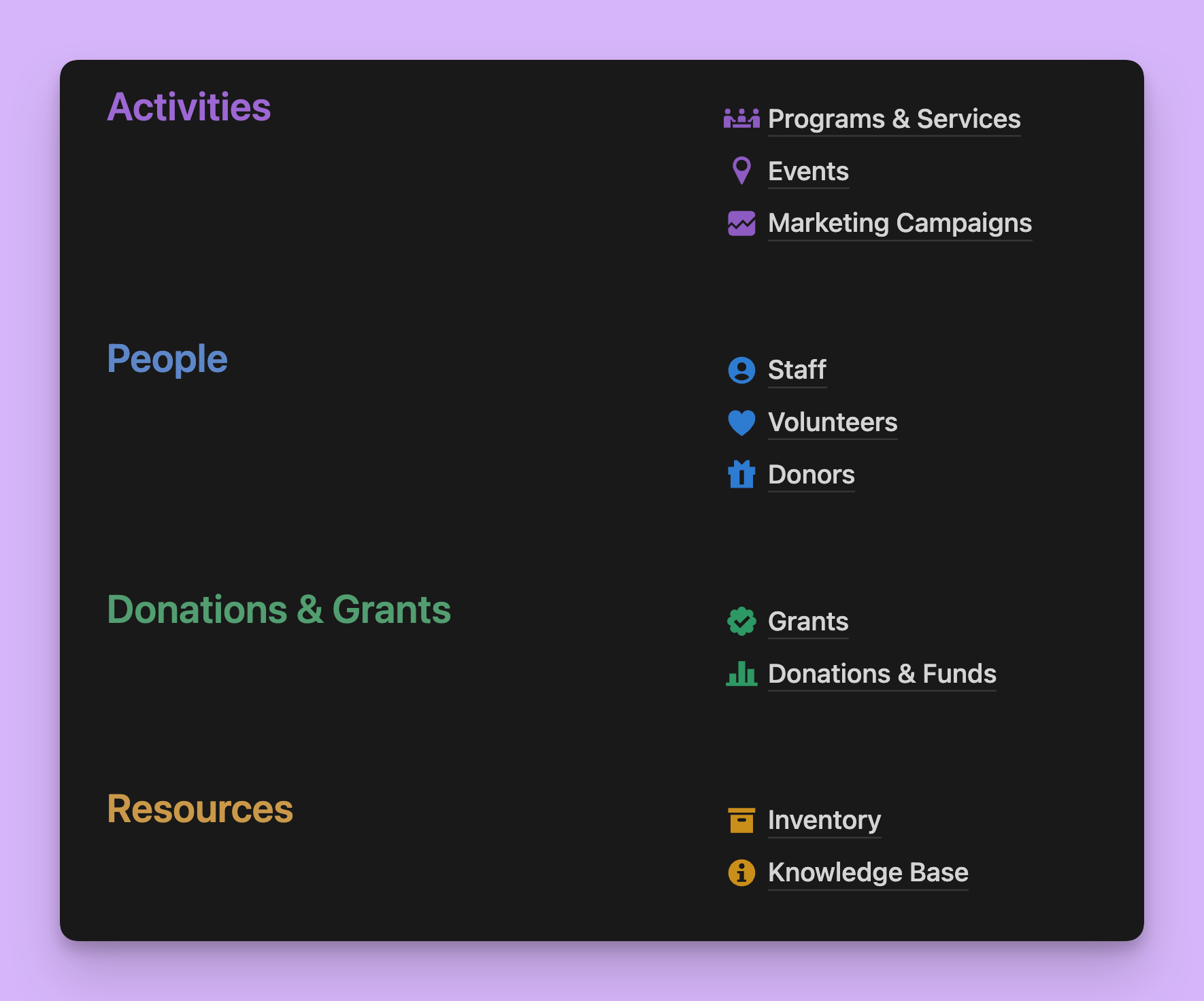
In this workspace for a fictional non-profit organization, I use color to group the main areas of the organization (activities, people, finances and resources). This color scheme is consistently utilized throughout the workspace.
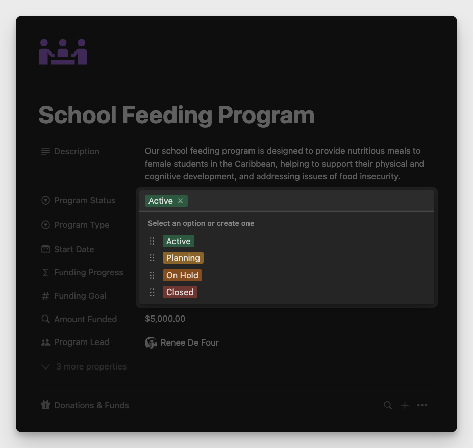
Another way of using color to communicate is by applying a traffic light color coding system when working with project status, as shown below.
Pay attention to page structure
When it comes to page structure, the main point to keep in mind is being consistent across all pages of the workspace with the layout that you choose. This means that if you use a divider below the page title on one page, it should be present on all pages as well. The same goes for headings and any other major page elements that are repeated across other areas of the workspace.
Know thyself
Experiment, play around, watch videos and learn what works best for you. Over time, you will develop your own style and that will also influence the cohesiveness of your workspace. For example, over time I’ve learnt that:
- I prefer dark mode over light mode
- I rarely use covers on pages because I find them distracting but you may find that they add character to the page
- I turn off top-level page discussions in most of my personal databases because I find that they visually clutter the page but many people use these to leave notes and reminders for themselves and of course they are helpful when working with a team for asynchronous communication.
The more you use the application, the more you will know what works best for you.
Wrap-Up
Quick recap of the 5 strategies that you can use for a visually cohesive Notion workspace:
- Keep a tidy space
- Use icons intentionally
- Use color as a means of communication
- Pay attention to page structure
- Know thyself
I hope that you've found these practices helpful and that you can apply anything that resonates to your own workspace.